
Nike football kits 2020/21 - a world without templates

Warning: this is a template-free zone.
Back in February, Nike sent shockwaves throughout the football shirt world by claiming that templates were now a thing of the past. They kicked things off with the outstanding Nigeria and South Korea kits, sending jaws down to floors and making us all search frantically for our wallets. Full disclosure, I opened mine more than once.
These were Nike kits packed with confidence and character, featuring striking patterns which were fully immersed in the culture of each nation. Basically, they were football shirt-shaped works of art, giving us a taste of the future and getting us a bit giddy in the process. Well, now the future is here, and I can say it still tastes pretty darn good.
While those early kits definitely blew us all away, there was a worry that maybe Nike had peaked a little too soon, set expectations too high. Now that most of next season’s kits have been released, however, it’s become clear that Nike’s 2020/21 collection more than lives up to the insane hype. In fact, I’m already reaching for my wallet again.
For me, Nike are winning this year’s “battle of the brands”, but there’s no need to just take my word for it. Their bold new approach is best summed up by what they’ve done with these six home shirts…
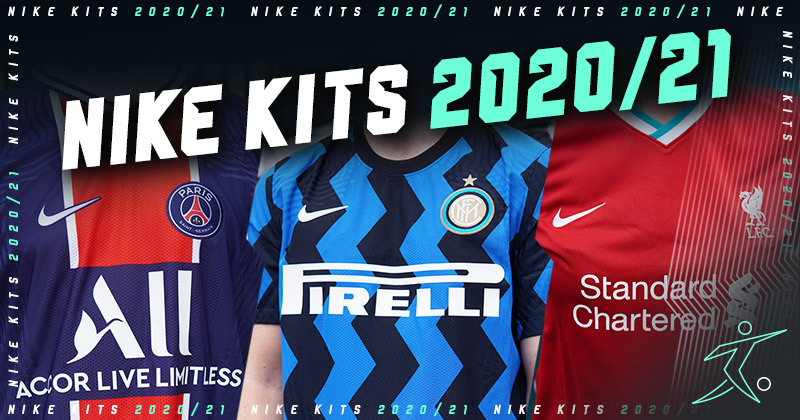
1. Inter Milan

This might be the most surprising Inter kit I’ve ever seen. Nike have given us all the boldness promised by those dazzling South Korea kits, serving up the kind of striking pattern usually reserved for away and third strips. It’s a football shirt which immediately had the desired effect: it caused one hell of a stir and got people talking.
Just like the eye-popping away shirt, the home design draws inspiration from postmodern Milanese designers, embracing the culture of the city and offering a fresh take on the club’s traditional style. The wavy, zig-zagging Nerazzurri stripes were expected by exactly nobody, creating one of the most radical home shirts I’ve seen in a very long time.
There are links to the legendary Biscione and the detailing is downright exquisite, but this shirt also signals something far more important. There is unlike anything we’ve seen before, and Nike are staying true to their template-free promise.
2. Atletico Madrid

The new Atletico Madrid kit offers something completely different. This is a far more traditional, old-school home shirt which is just about suitable for formal dress codes. The famous stripes have been distorted to freshen things up a bit, but that gorgeous collar creates an irresistible classic style and keeps the whole thing looking downright elegant.
Nike haven’t tried to shock us with this one, but still made us immediately sit up and take notice simply because of how damn smart it looks. The future and the past have been seamlessly brought together here, in a design which also pays homage to the tireless work ethic of Los Rojiblancos. Yeah, I seriously can’t get enough of it.
3. Paris Saint-Germain

This design taught me one very important lesson: all the best PSG home shirts have a broad central stripe. I’ve been a fan of Nike’s work in Paris over the past few years, but there’s no doubt that this is the strongest home strip I’ve seen them produce in a very long time. The players who’ll wear it aren’t half-bad, either.
The Hechter stripe can do no wrong, if you ask me. It sits on most of my favourite PSG shirts from the 1990s, and it feels like this new design has actually given the club some of its identity back. Although the sponsor could never really rival Opel, Nike have once again knocked this completely out the park - especially since it’s paired with such a beautiful away shirt.
4. AS Roma

Speaking of beautiful away shirts, Nike have done yet another stellar job with AS Roma this summer. Last season, we actually named Roma’s away kit as our favourite shirt of the year, so I’m not quite sure how Nike have managed to follow that up with something even better. The Lupetto rules all, I guess.
But they’ve also done fantastic things with the home shirt, paying tribute to the iconic “ice lolly” kits of the late 70s and early 80s. There might be no Bruno Conti this time, but instead we’re treated to modernised Giallorossi stripes which thankfully continue on the back, alongside some truly sensational detailing. A remarkable blast from the past.
If this proves to be Nike’s last Roman adventure, then they’ll be leaving the Italian capital on an unbelievable high-note. It’s been a fantastic partnership, and it’s one of the club/brand break-ups we just never wanted to see.
5. Barcelona

Oh, yes. This feels like a proper Barcelona shirt. After a bit of experimentation last season, the iconic Blaugrana stripes are back in all their glory, except this time they come alongside a sensational dash of yellow. Featuring again in the classy crew-neck collar, this injection of colour takes us right back to Barca’s 2010-11 season - and there ain’t nothing wrong with that.
The halftone gradient gives the whole design a feeling of depth, but the real standout feature is how Nike have used the next-gen Vaporknit construction. This texture integrates perfectly with the pattern of the stripes, serving up the strongest example yet of how this knitted material can actually improve the look of a shirt. Exciting times are ahead, I reckon.
Of course, you’ll only be able to enjoy this insane texture by bagging the authentic version, but I’d honestly argue it’s more than worth the extra cash in this case. It feels like Nike have opened the door to all kinds of possibilities here, and I can’t wait to see more shirts designed to really complement this texture. Fingers crossed.
READ | Our guide on the differences between authentic and replica football shirts.
6. Liverpool

The headline act of Nike’s 2020/21 collection. This new partnership has generated plenty of excitement over the last few months, with fan-made concept kits, rumours and bizarre leaks sending the internet into meltdown. Once again, Nike were under intense pressure to deliver and, once again, they’ve somehow lived up to all the hype.
Not only have their marketing campaigns been absolutely fantastic (seriously, you need to check out some of their launch videos), but the shirts themselves are also pretty incredible. While the terrific away kit rips up the football shirt rulebook, this exuberant design is countered beautifully by a smarter and simpler home shirt.
There’s no doubt that the home is a lot safer, but Nike are being anything but “boring” here. The traditional Liverpool style has been freshened up by a brighter shade of red and bright pops of teal, giving a nod to the past while also looking ahead to the future. In short, this is the perfect start to one of the most exciting partnerships in world football.
Nike have absolutely smashed it this year, and you’re probably desperate to add a couple of these new shirts to your collection. Well, you might as well save a few extra pennies along the way, so compare prices at FOOTY.COM to get the best deal on all the awesome shirts above!
Tagged in this article:


Brands
Help & Support
From The Blog
