
BEST CHAMPIONSHIP KITS 2025/26: EVERY HOME SHIRT RANKED
11 months ago
Oh yes, it’s that time again—I'm back and ready to dive headfirst into the wild world of Championship kits for the 2025/26 season, with all the unfiltered opinions you never asked for (but are getting anyway).
Every new campaign delivers a fresh mix of instant classics, bold misfires, and the occasional “what were they thinking?” moment—and this year’s is no different. Spoiler alert: it’s a very interesting year for kits. From retro remakes to tiger print sleeves, the designers have definitely been busy.
So grab a brew, brace yourself for some strong takes, and let’s get stuck in.
24. Watford
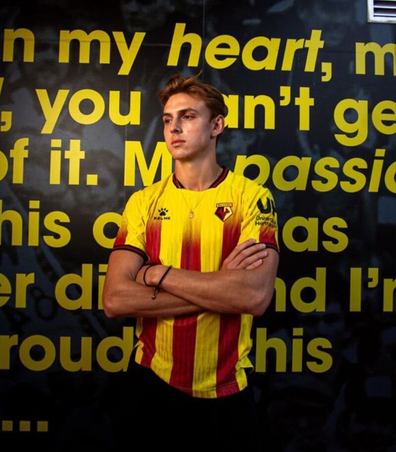
Image from Watford F.C.
Watford’s new home shirt is certainly eye-catching, but it’s a bit of a mixed bag. The classic yellow base gets a twist with fading red stripes rising up the shirt, creating a bold gradient effect that’s... well, open to interpretation. My interpretation? Not very nice.
There’s a nice jacquard texture in the fabric and the black-and-red striped collar and cuffs tie in well with the badge, but it’s all let down by a clunky sponsor logo that clashes badly with the design.
I see the vision, I just don’t think it’s worked.
23. Preston North End
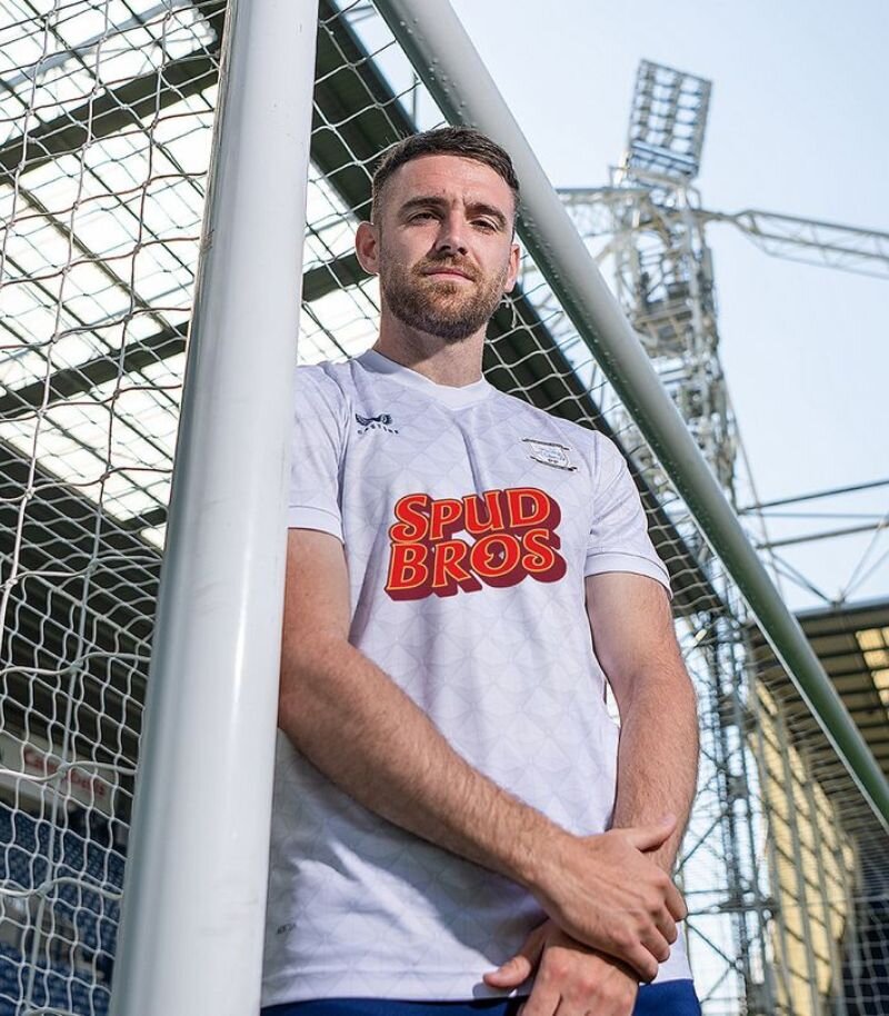
Image from Preston North End F.C.
Preston North End’s new home shirt takes a slight detour from last season’s effort, but whether it’s a step forward is up for debate.
The all-white base features a subtle pattern that, if I’m being honest, does have a bit of a mattress vibe.
The new sponsor, Spudbros, is brilliantly local and undeniably iconic—but its cartoonish logo sticks out like a rogue chip in a portion of fries. It’s not a bad shirt by any means, just not one that’s likely to get pulses racing.
22. Stoke City
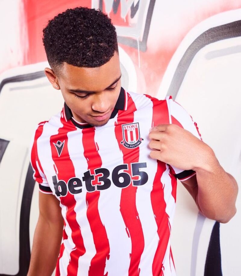
Image from Stoke City F.C.
Stoke City handed the reins to the fans for this season’s home kit—and while it might not be everyone’s first pick, there’s something refreshing about that.
The classic red and white stripes get an abstract makeover, with wavy lines that look like they’ve been painted on with bold brush strokes. It’s a striking reinterpretation, if a bit divisive.
That said, the smart polo collar and matching sleeve cuffs add a nice touch of polish. Fan involvement in kit design is always a win—especially when they're the ones splashing the cash every year.
21. Coventry City
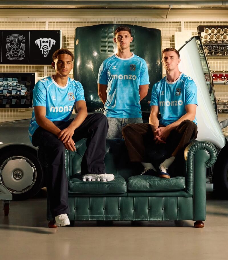
Image from Coventry City F.C.
Coventry City’s new home shirt is certainly a bold move. The design itself is strong, featuring a pixelated pattern made up of the club’s iconic crest—a clever nod to 90s styling that really works. Crisp white detailing adds a nice contrast too.
But the big talking point is the shade of blue. They’ve moved away from their classic sky blue to something brighter, and while some might love the switch-up, it just feels a little off to me.
A solid concept, but the colour choice might split the crowd.
20. Millwall
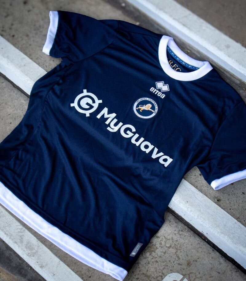
Image from Millwall FC.
Millwall’s home shirt is a classy anniversary effort from Erreà, marking 140 years in style. The navy base is as traditional as it gets, elevated by a sharp white collar and cuffs.
A special gold crest takes centre stage—literally—sitting proudly in the middle of the chest to honour the milestone. Normally, central logos can be a bit hit or miss, but here it feels right.
Inside the collar, the initials ‘M.R.F.C.’ pay tribute to the club’s roots as Millwall Rovers. All in all, a strong, no-nonsense design—just like the club itself.
19. Sheffield United
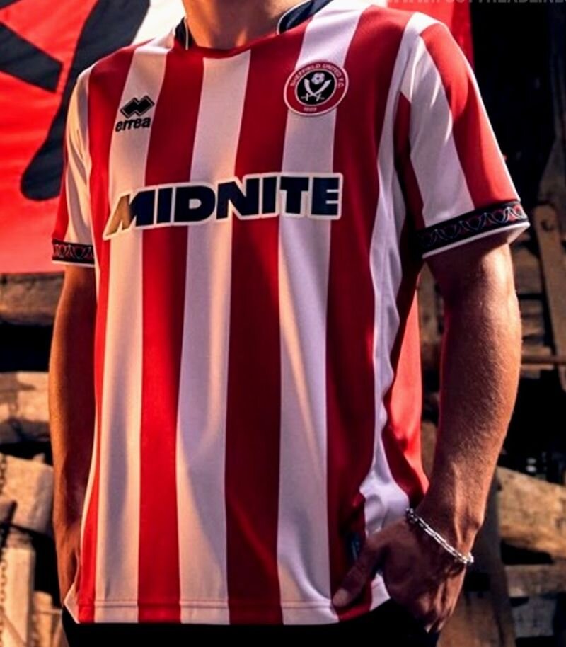
Image from FootyHeadlines
Sheffield United’s home shirt this season is a step up from last year, but still plays it a little too safe.
The classic red and white stripes are there of course, with some red and black detailing on the collar and sleeves—a tribute to the steel blades of Sheffield’s industrial past and the historic Wortley Top Forge.
Those touches are great, but they’re not quite enough to elevate the kit beyond “solid but safe.” A nice effort, just lacking that extra spark for me.
18. Charlton Athletic
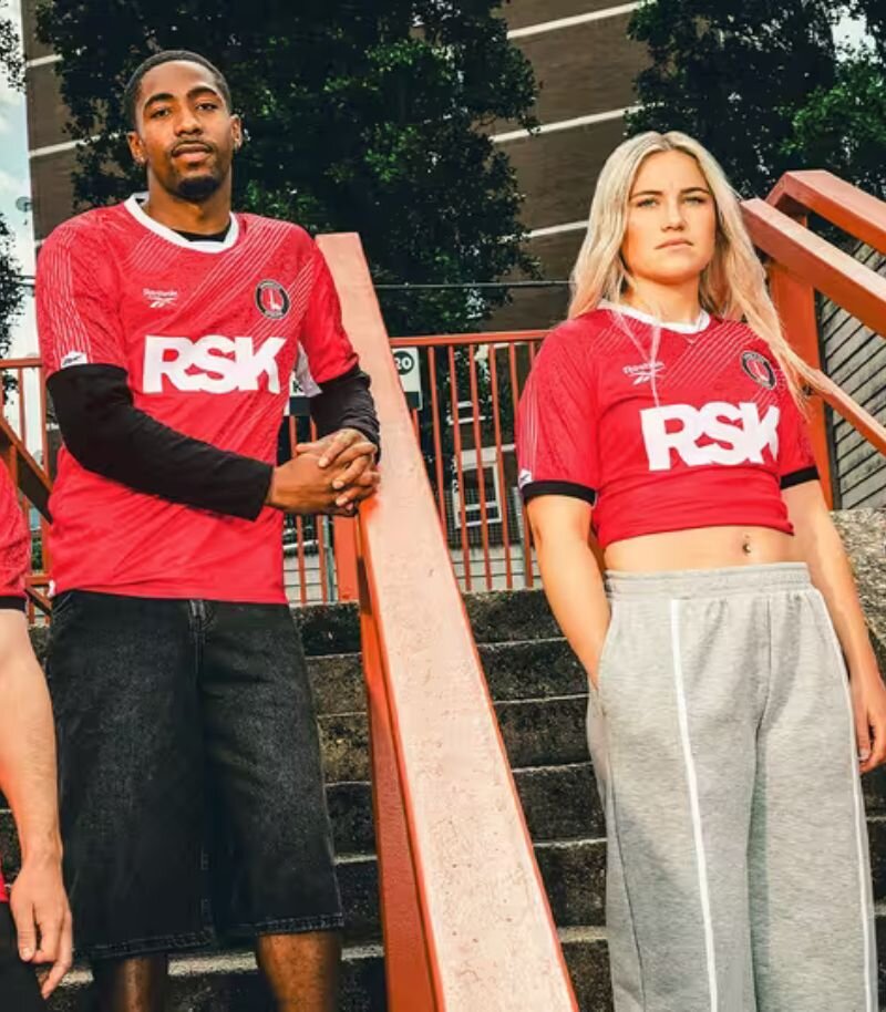
Image from Charlton Athletic F.C.
Charlton Athletic’s new home shirt sees Reebok take the reins from Castore, and it’s an instant upgrade.
A bold diagonal pinstripe pattern slices across the red base, nodding cleverly to the club’s sword badge, while the crisp white collar and black sleeve cuffs pull the look together perfectly.
There’s a slightly rogue splatter graphic near the shoulders that feels a bit out of place, but it’s easy to forgive when the rest of the design is this sharp. All in all, a strong debut from Reebok.
17. Hull City
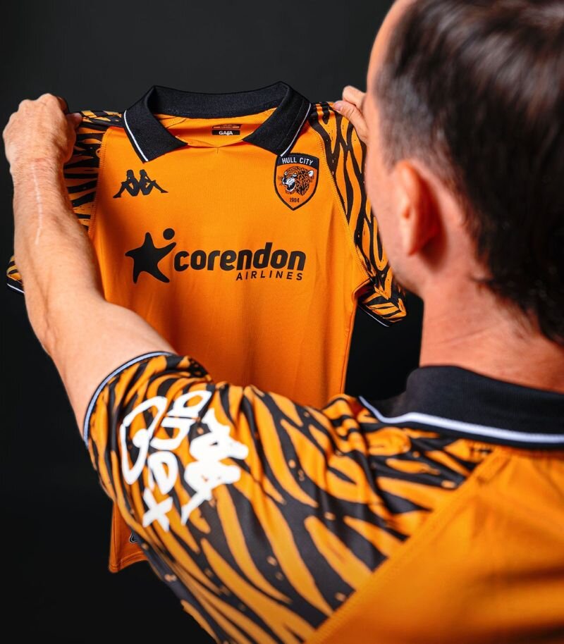
Image from Hull City
Hull City have shaken things up this season, ditching the stripes in favour of a bold new look—and it absolutely pays off.
The amber base is paired with striking tiger print sleeves, nodding back to their iconic kits from the early ‘90s, but not too much in your face. A smart polo collar and matching sleeve cuffs with subtle white pinstripe detailing add a polished finish.
It’s a big shift from recent designs, but this shirt proves that different can definitely be a good thing.
16. Blackburn Rovers
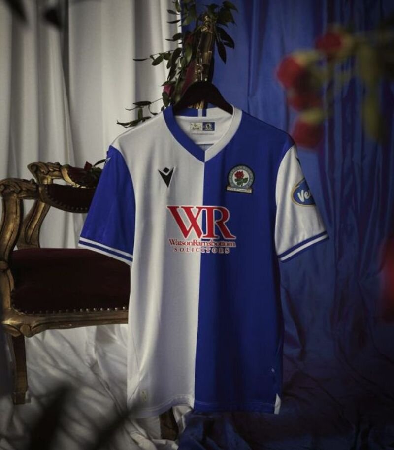
Image from Blackburn Rovers F.C.
Blackburn Rovers celebrate their 150th anniversary with a home shirt that blends tradition and subtle flair. The iconic blue and white halves return, but this time they’re joined by delicate pinstripes symbolising the thorny stem of the Lancashire rose, very cool.
A special anniversary crest on the back of the collar, rose-themed detailing along the hem, and the numbers 1875–150–2025 add a proper sense of occasion.
The opposing collar colours might split opinion, but overall it’s a classy upgrade on last season’s effort.
15. Birmingham City
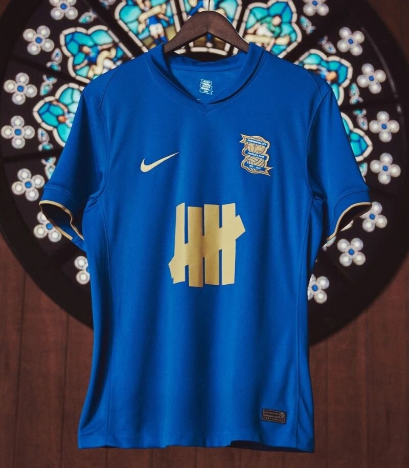
Image from Birmingham City F.C.
Birmingham City join the anniversary celebrations this season with a home shirt that gets the gold treatment—and pulls it off with style.
Swapping the usual white detailing for gold, the design feels classy, with even the sponsor logo getting the memo (a rare thing). The overall vibe is minimalistic and retro, tied together nicely with a tidy polo collar.
It’s not trying to reinvent the wheel, but as anniversary shirts go, this one’s a lovely effort.
14. QPR
.jpg?width=770)
Image from Queens Park Rangers F.C.
QPR’s home shirt this season is a great tribute to the legendary 1975/76 side, 50 years on.
The classic blue and white hoops return, but with a twist—there’s a chequered pattern woven into the blue sections that adds just the right amount of texture.
The blue neckline and understated sleeve cuffs feel modern without straying too far from the past, and the collar colour mirrors that of the original ‘75 kit. A classy anniversary shirt done just right.
13. Sheffield Wednesday
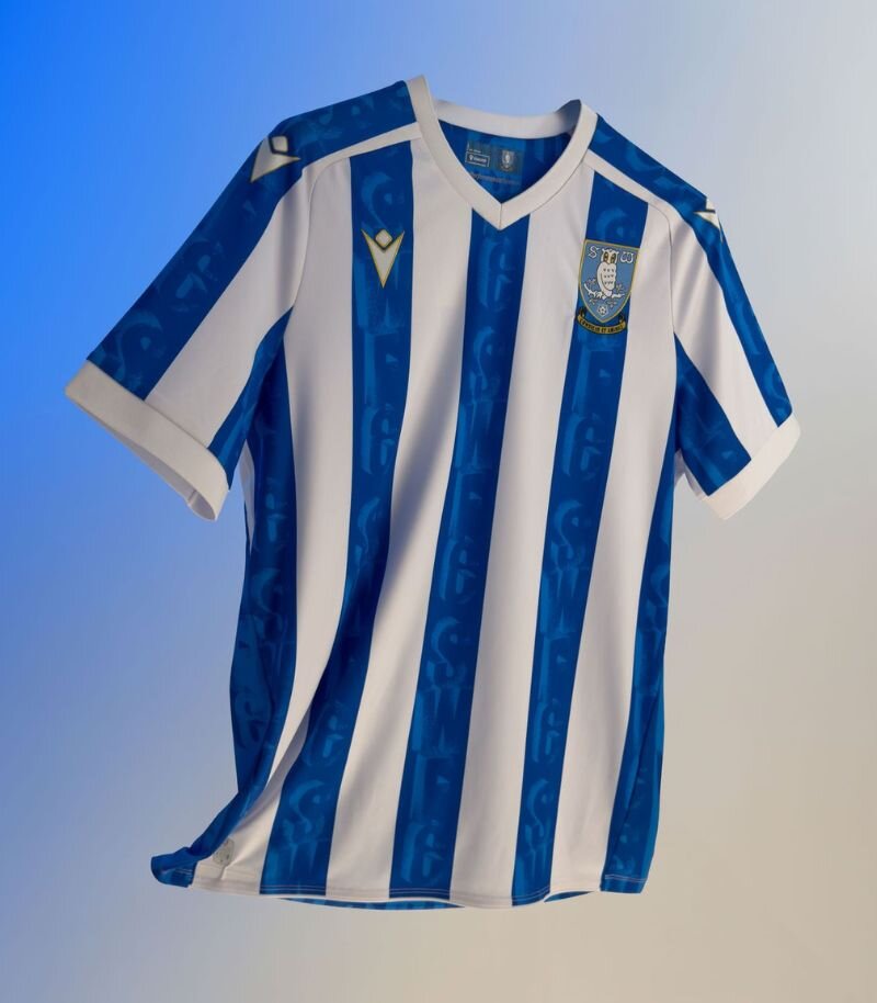
Image from Sheffield Wednesday F.C.
Sheffield Wednesday keep things classic with their iconic blue and white stripes—but add a fresh twist that really works.
The blue stripes feature a slick 3D-style pattern made up of the SWFC initials, giving the shirt some extra depth without overcomplicating things. Subtle yellow detailing is tucked in here and there, adding just the right amount of flair.
It’s clean, modern, and a definite step up from last season. Well played, Owls.
12. Middlesbrough
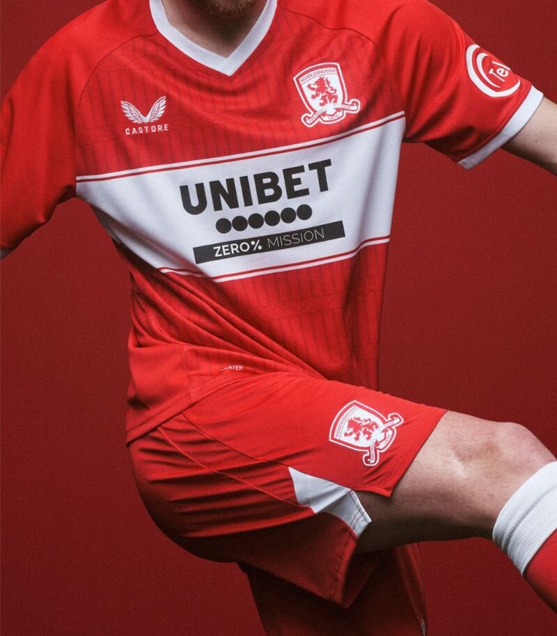
Image from Middlesbrough F.C.
Middlesbrough’s home shirt this season leaves me a bit torn—it’s not bad, but it’s hardly exciting either. The iconic white chest band returns on a red base, but it all feels a bit same old.
It does mark 30 years at the Riverside, with a subtle pattern inspired by the famous Ayresome Park gates woven into the fabric—a lovely touch, just a bit too easy to miss.
It’s a clean, classic Boro look, but there’s just not a lot going on to talk about. Not awful, not amazing.
11. Swansea
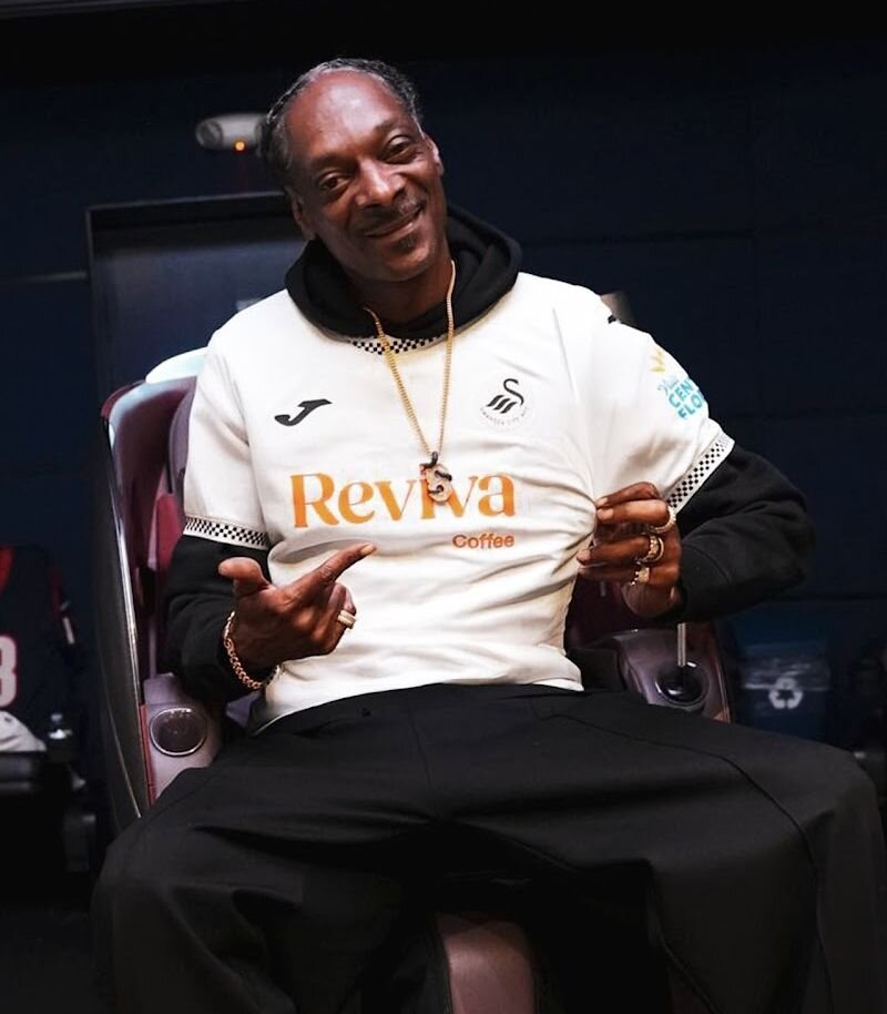
Image from Swansea City A.F.C.
Swansea City’s new home shirt is a clean, no-fuss effort—crisp white with a checkered pattern on the sleeve cuffs and collar that adds a subtle twist.
It’s a cool look and definitely something a bit different, but I can’t help missing the yellow details from last season that gave it a bit more flair.
Interestingly, the kit launch featured Snoop Dogg and a cheeky dig at Wrexham—whether that’s genius marketing or just bizarre is still up for debate. Shirt-wise, though, it’s solid.
10. West Bromwich Albion
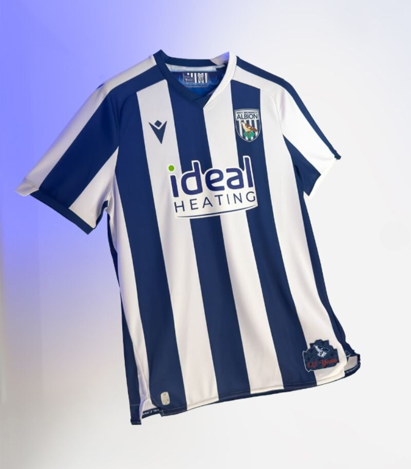
Image from West Bromwich Albion F.C.
West Brom stick to their roots with a classic navy and white striped home shirt, but sprinkle in a few modern touches to keep things fresh.
The split-colour collar is a bit of a trend lately—still a divisive choice, but it blends in better here than on most. This one’s a nod to 125 years at The Hawthorns, marked with a commemorative crest inside the collar and a special jocktag near the hem.
The oversized sponsor isn’t ideal, but at least it keeps to the colour scheme. Red details from last season have been dropped, resulting in a much cleaner overall look.
9. Ipswich Town
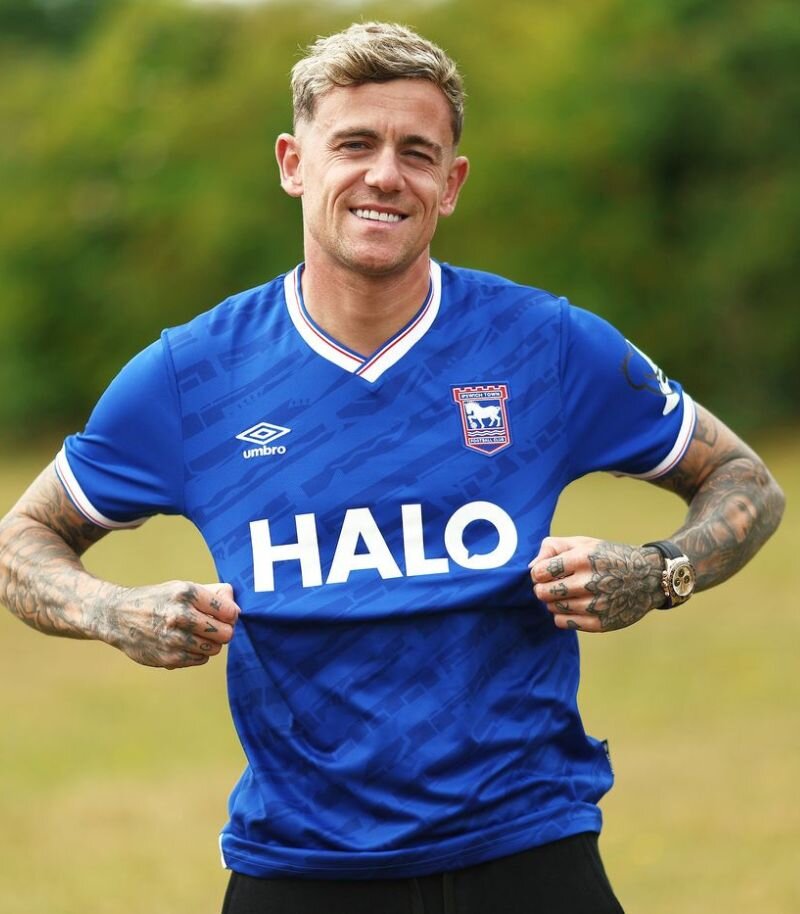
Image from Ipswich Town F.C.
Ipswich Town’s home shirt sticks to tradition with its classic blue base, but adds a subtle twist for the detail-lovers.
The pattern woven into the fabric is a deconstructed take on the modern club crest, marking 30 years since its introduction. A white collar and cuffs, trimmed with neat red and blue stripes, round off a really sharp look.
And with all due respect to Ed Sheeran, it’s kind of refreshing to see a clean front without the tour logo this time around. A classy, well-balanced kit.
8. Leicester City

Image from Leicester City F.C.
Leicester City went low-key with their home kit reveal—no flashy promos, just straight out onto the pitch. But honestly, when the kit looks this good, it speaks for itself.
The classic blue base is elevated by subtle pinstripes, with gold detailing and a crisp white collar adding a touch of class. It's one of my favourite Leicester home kits to date.
If that collar had been gold too, it might’ve climbed even higher up the rankings—but as it stands, it’s still a seriously sharp look.
7. Southampton
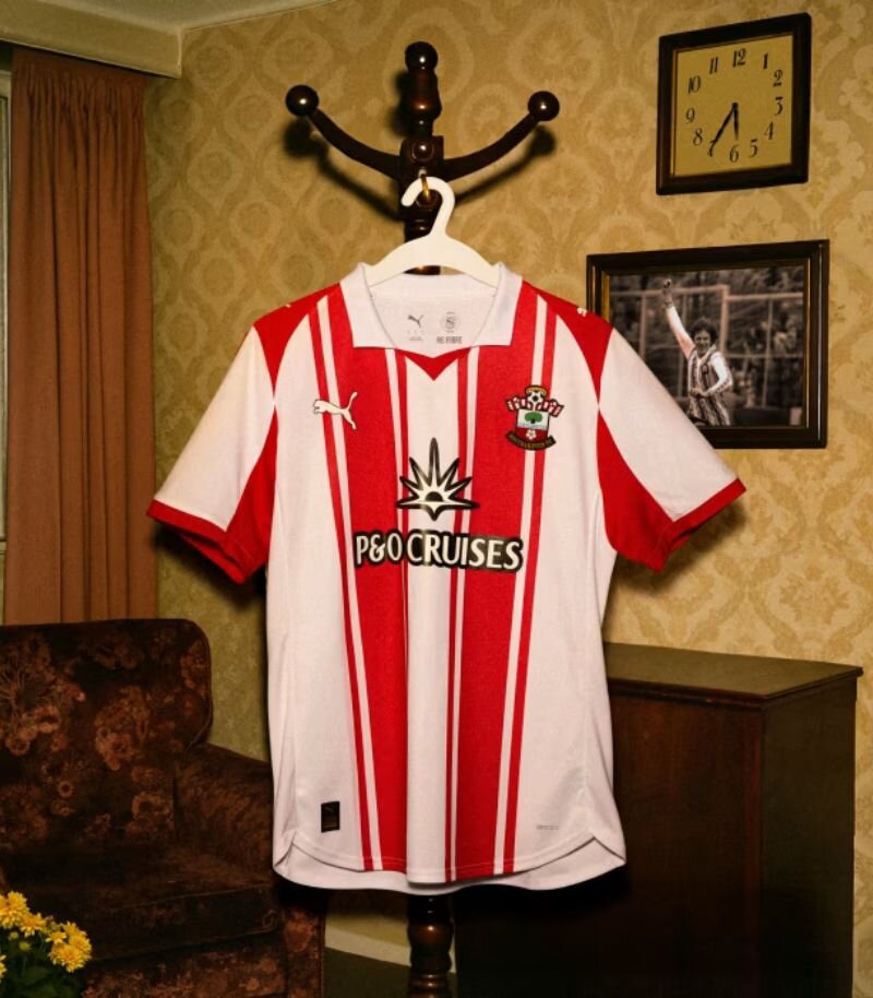
Image from Southampton F.C.
Southampton’s home shirt this season is a perfect example of how small tweaks can make a big impact—and I absolutely love it.
It’s not miles away from last year’s design, but swapping the black collar for a retro white polo and adding extra red striping to outline the classic stripes has completely elevated the look.
It feels bolder, sharper, and more retro in all the right ways. A simple switch-up, brilliantly done.
6. Portsmouth
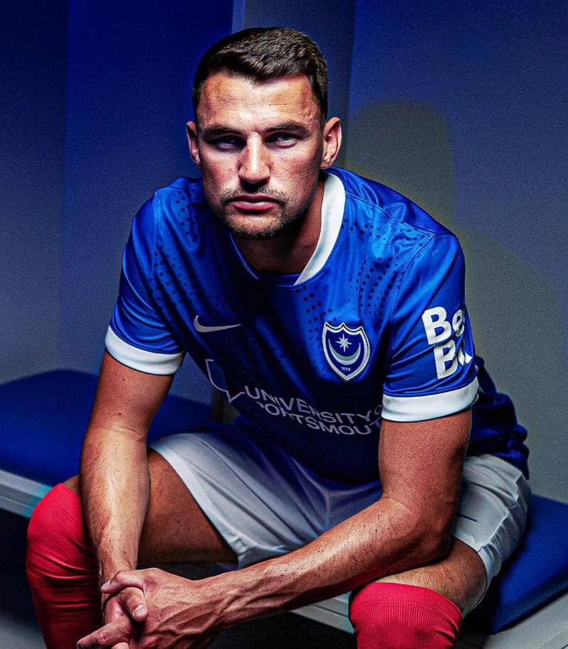
Image from Portsmouth F.C.
Portsmouth mark their return to the Championship with a home shirt that’s both fresh and fitting.
The classic blue base is brought to life with a dotted wave pattern—a subtle nod to the club’s coastal roots—while crisp white detailing on the collar, cuffs and side panels adds to the vibe.
It’s clean, it’s stylish, and it feels properly Pompey. Last season’s kit was great, and this one’s right up there with it.
5. Bristol City
.jpg)
Image from Bristol City F.C.
Bristol City’s home shirt this season is a no-nonsense classic—and all the better for it. The return of the polo collar sets the tone for a design that strips things back in the best way possible.
A bold red base with clean white side panels, white logos, and that crisp collar edged with a subtle black stripe gives off serious retro vibes, calling back to the '98 home kit.
After a few more modern takes in recent seasons, this simple approach feels like a real win.
4. Norwich
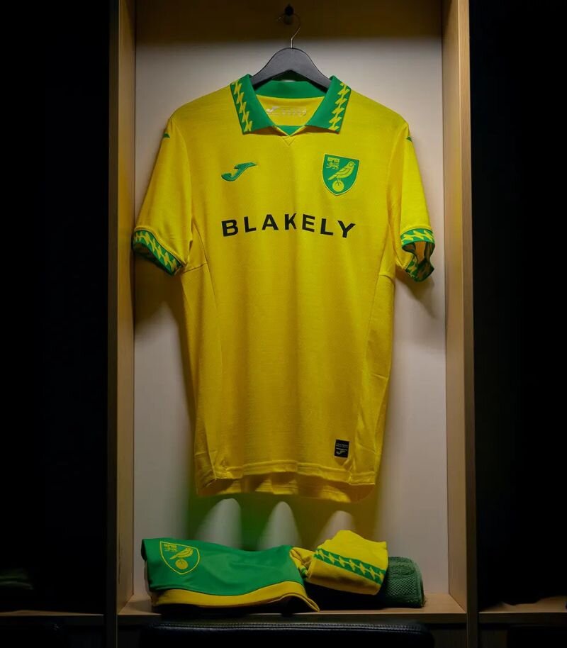
Image from Norwich City F.C.
Norwich City’s home shirt has fans buzzing—and rightly so.
It’s a glorious blend of retro and modern, with that iconic yellow base brought to life by a 90s-inspired pattern on the sleeve cuffs and polo collar.
It wouldn’t look out of place in a grainy Match of the Day highlight reel, yet still feels totally at home in 2025. Nostalgic without being gimmicky, this one’s a proper winner.
3. Oxford United
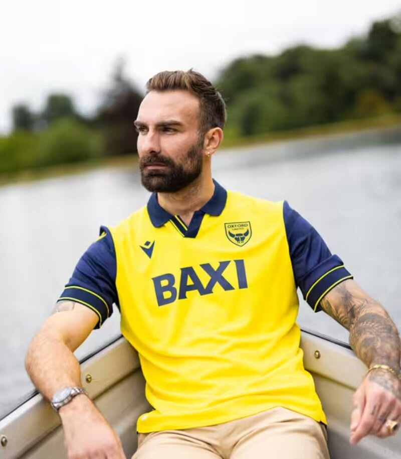
Image from Oxford United
Now this is the kind of kit I love to see. Oxford United’s home shirt is an absolute beauty—blending classic and modern in all the right ways.
Sticking to their traditional navy and yellow colour scheme, it’s the sharp detailing on the collar and cuffs that really sets it apart. The collar itself is a clear nod to the 90s, adding a perfect touch of nostalgia.
The longer you look at it, the better it gets—a proper modern classic.
2. Wrexham
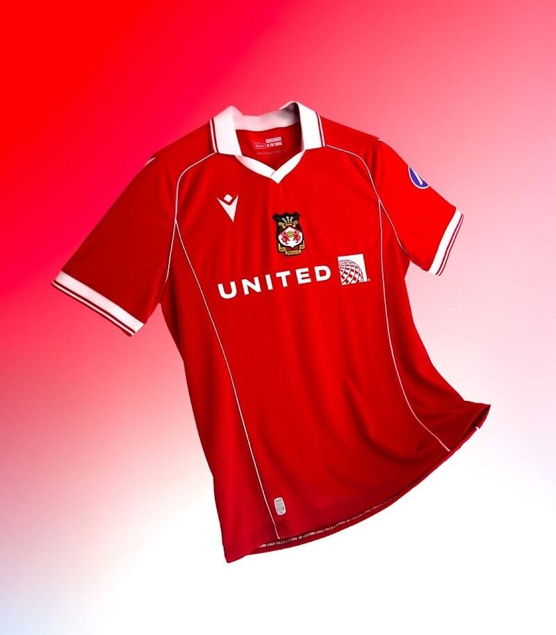
Image from Wrexham A.F.C.
Wrexham’s new home shirt is a perfect choice for their Championship debut—steeped in history and full of retro charm.
Inspired by the kits worn between 1981 and 1983, it brings back the iconic red base with a classy deep red pinstripe running through. The white and red collar and cuffs add a vintage touch, and the centrally placed badge ties it all together beautifully.
It’s a kit that has just the right amount of heritage without feeling stuck in the past—a nostalgic nod done absolutely right.
1. Derby County
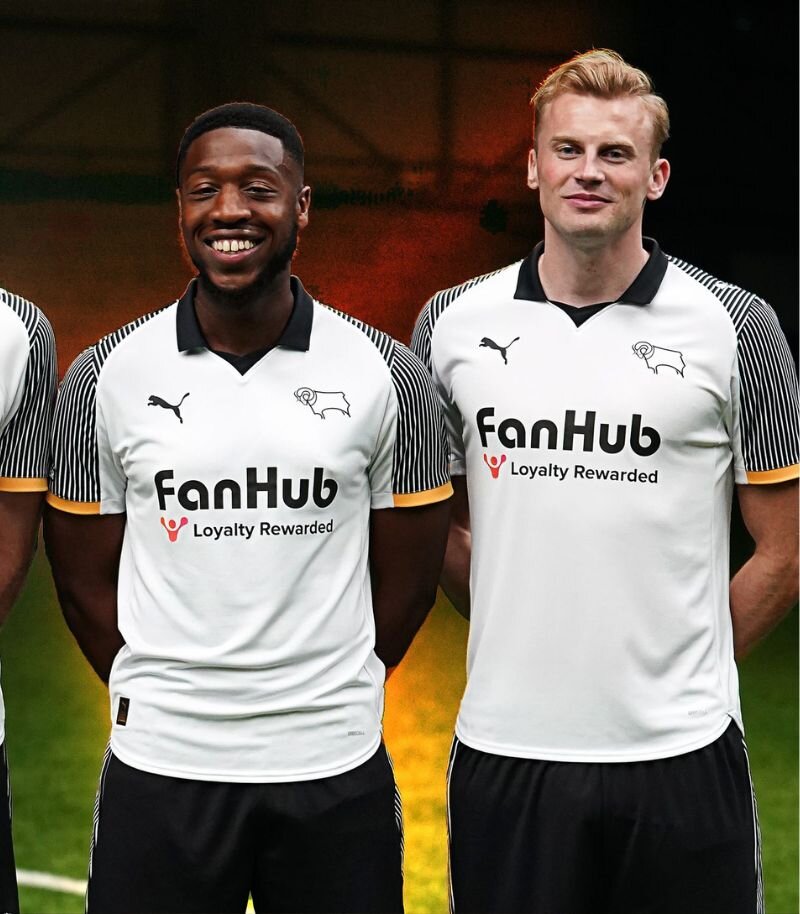
Image from Derby County F.C.
Derby County have absolutely NAILED the retro remake game with this season’s home shirt.
Inspired by their 1995–96 promotion-winning kit, it’s a glorious throwback packed with nostalgia—striped sleeves, yellow detailing, and that standout collar all make a triumphant return.
The club’s “Regeneration” campaign cleverly links past and present, featuring fans from the original era alongside their kids in the new version.
Retro remakes can be risky, but this one strikes the perfect balance of old-school charm and modern polish. Bravo, Derby, my winners this time round.
And there you have it—every Championship home kit for 2025/26, ranked with all my enthusiasm and overanalysis. But hey, that’s just my opinion… What do I know? I’m just someone who gets way too excited about collars and sleeve cuffs.
Think I got it wrong? Let me know (politely) on our socials. And if you're not all kitted out yet, don’t forget to check out my Premier League rankings too.
Here's to another class season!
Tagged in this article:

in
shirtsOnce a force to be reckoned with on the pitch, Tasha’s love for football spans over a decade—until her playing career was cut short by the classic knee injury story—a setback that shifted her focus but never dulled her love for the sport. She previously played for Carlisle City and Stanwix Ladies before swapping her boots for a whistle. Now an FA-qualified referee, she spends her time officiating for Newcastle United’s academy as well as your typical Sunday league, channelling her inner Anthony Taylor on weekends (but without the VAR controversies). Since joining the team in 2023, Tasha has crowned herself the resident expert on all things sport and fashion. Whether she's ranking questionable kits or offering insight into trending trainers, her observations are sharp, insightful, and on point. She's got a knack for finding the perfect blend of performance and style—just don’t ask her to pick a favourite Premier League kit of the season unless you're ready for a heated debate.


Brands
Help & Support
From The Blog
